I’ve been running data on spy and am finding some interesting results. I’m not sure how much past results will predict future results, but I’m intrigued and would like to get others’ thoughts on this. If anyone would like to see the actual data in Excel, I can provide it individually.
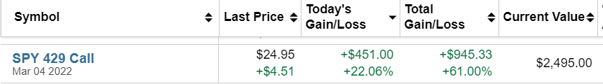
Based on my analysis, I’m considering selling about 45% of my investments around the first of the year and waiting till March-June timeframe to reinvest, or when the data groups tell me it’s time. Most of my investments are in spy currently.
The Data:
-
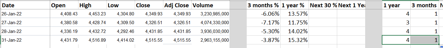
S&P 500 daily close figures from yahoo finance (S&P 500 (^GSPC) Stock Historical Prices & Data - Yahoo Finance). This goes back to 1929.
-
Calculated historical 1 year and 3 month returns per day so I could gain some perspective on each day’s close value
-
Calculated future 30 day and 1 year returns so I could attempt predictive modeling
-
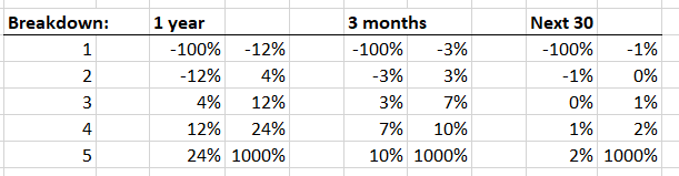
Created arbitrary return groups (5 groups) to minimize data complexity. The return groups were
-
less than -12% per year
-
-12% to 4% per year
-
4% to 12% per year
-
12% to 24% per year
-
24% + per year
Findings:
There were clear monthly trends that I’ve already heard discussed on various forums and CNBC (i.e. September is the worst month of the year).
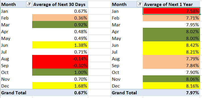
Based on this data, I conclude that it is best to buy in June, July, and Dec and sell in Feb, Aug, and Sept.
Findings - Part 2
This is the part that I find most interesting and would like additional input. It’s complicated to look at, but I’ll explain.
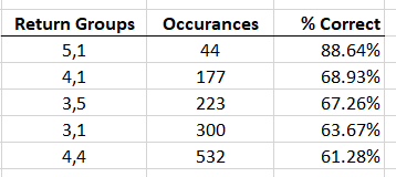
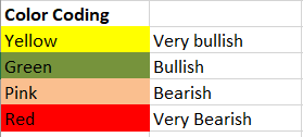
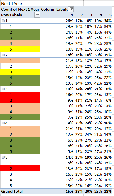
The first pivot table provides a % likelihood that the next 30 days return will fall in each grouping (1 is bad, 5 is terrific). The row labels show the historical 1 year (1st number) and 3 month (2nd number) return groupings. Think of this as the historical data in slices. For reference, today we are in the 5,3 slice. So if you go down to the 5, then find the 3, you see the % likelihood the next 30 days’ return will be in each grouping. I’ve labeled this pink because over the next 30 days there is a 46% likelihood that SPY will be negative or just barely above breakeven (adding together groups 1 and 2). There is only a 47% likelihood of significant gains (groups 4 and 5) which would generate over 1% for the month. This is compared to the slices such as 5,1 4,1 2,4 and even 4,3 and 4,4 which have likelihoods exceeding 50% for significant gains with less risk of loss.

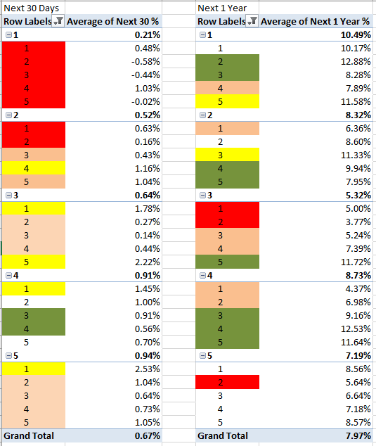
The next pivot table shows similar data but with 1 year future returns. Notice that the 5,3 slice still does not look desirable. I did not color code it because it falls middle of the road within the data set. However, several other slices look much better.
The 3rd pivot table shows average returns for the slices for 30 days and 1 year which is also helpful, but fails to show volatility/risk. Notice here again, the 5,3 slice shows a lower than average 30 day return of 0.64% and a 1 year return of 6.64%.
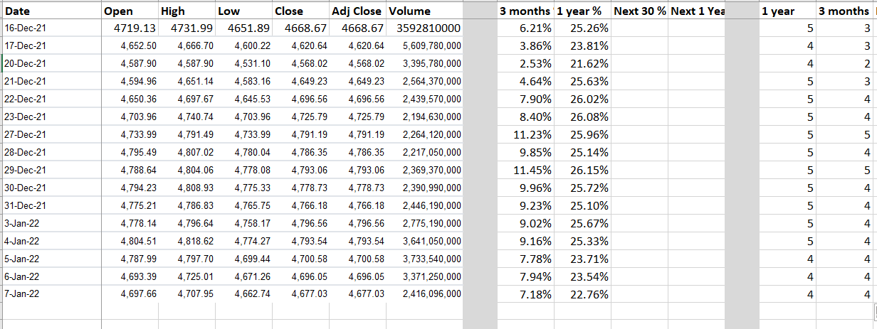
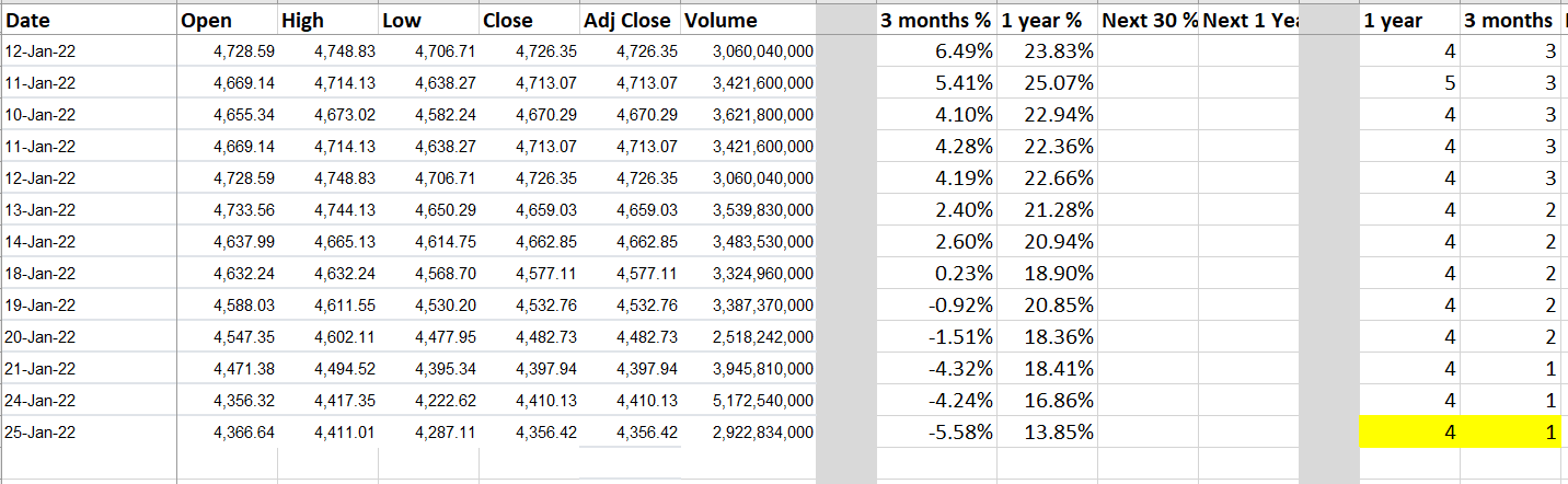
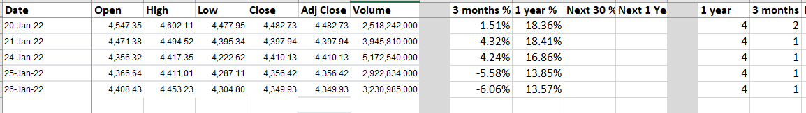
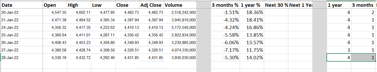
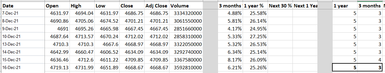
Here is a screen shot of some of the data for reference. You can see to the far bottom right is where the slice is assigned. I do find it interesting that only a day before we were in the 5,4 slice, however, results for those two slices are similar.
Given the billions spent by hedge funds and by banks for analyst salaries, I’m sure there are models a trillion times more sophisticated than this. But I do see some potential value in this for regular folks like us trying to make some extra money as a side hustle. I look forward to some input from this tremendous group of people.