2022 has had one of the most complicated macroeconomic conditions we’ve seen in the past few decades. First, we had what looked like a complete shutdown of the global economy with the onset of the Pandemic. This shutdown affected everything from asset prices to employment and more. With it came supply chain problems, a decreasing labor force, and a worrying economic outlook. Due to this, most companies and analysts forecasted a weakened consumer. With this lower demand, two things happened. First, inventories were not restocked. Why would companies buy products if the economy seems to be shutdown for the foreseeable future. Second came stimulus. Central banks and Fiscal Policies injected an unprecedented amount of liquidity into the system. Whether it be Zero Interest-Rate Policy, QE, or Stimulus checks, Central Banks and Governments were going to keep the economy alive no matter what. The macro seemed to be very worrying to everyone, from analysts to Central Bankers. Then, something happened. The consumer was strong. Whether it be boredom or necessity, the consumer, with their high savings rate, kept demand stronger than anyone expected. Strong consumer demand and low company inventories to meet demand is not a sustainable economic picture. So, with the “easy money” supplied by CBs and Governments, private industries did everything they could to meet the strong demand. Real asset prices inflated and profits surged. With this supply/demand imbalance came inflation. Reaching 40-year highs, inflation increased because of this rare macroeconomic backdrop, and was only boosted higher by inflated energy and produce prices caused by a war in Eastern Europe. Central banks have since stepped in to combat inflation, asset prices have started to come down, and companies have had struggles with increased inventories meant to supply a strong consumer. In this post, I hope I can help you see where we are and articulate where I think we are heading.
Before we start, I recently typed up a sort-of 101 on Bonds. If anyone needs a refresher or is simply curious about Bonds in general, I recommend you read that first. This post relies on a basic understanding on Bonds, yields, and what affects them.
Click here for my Bonds 101 Thread
One more thing. All the sources are hyperlinked, so if anyone wants to do a deep dive, feel free to click away. Let’s get started.
Where We Are
High inflation has been the name of the game for the past 12 to 18 months. In the latter half of 2021, consumer prices began to accelerate. With this worrying acceleration in inflation came an increasingly hawkish Fed (along with other Central Banks).
“Beginning later this month, we will reduce the monthly pace of our net asset purchases…”
-Chairman of the Federal Reserve Jerome Powell, November 2021
Starting with a reduction in the pace of Quantitative Easing, it was clear that credit markets were in for a rough ride, because of the Fed, if the inflation in Consumer Prices wasn’t brought under control. It looked like inflation would be brought down eventually, it was transitory after all. But then came the war in Ukraine.
“The FOMC raised its policy interest rate by 1⁄4 percentage point. The economy is very strong, and against the backdrop of an extremely tight labor market and high inflation, the Committee anticipates that ongoing increases in the target range for the federal funds rate will be appropriate. In addition, we expect to begin reducing the size of our balance sheet at a coming meeting.”
-Chairman of the Federal Reserve Jerome Powell, March 2022
Starting with the March meeting, credit markets started flashing warnings signs. First the 10-year and 30-year inverted, then the 5-year and 30-year, until we got to where we are today:
Yield Curve:
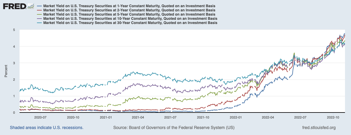
Source: St. Louis Fed FRED

Source: Wall Street Journal
As you can see, the whole Yield curve is inverted, and has been for some time. The 3-month is now almost equal to the 10-year yield. For that to happen, the Fed has had to project a raise in rates above the current risk-free (10-year) rate. That means willfully ignoring market participants and their flashing warnings signs of inversion across any credit market curve. Inflation expectations in Credit markets, so far, have remained “anchored” close to the Fed’s 2% goal. Because of these expectations behaving fairly normal, we are now where Chair Powell has wanted to be for a couple months now:
“(We) want to be at a place where real rates are positive across the entire yield curve.”
-Chairman of the Federal Reserve Jerome Powell, September 2022
Real Yields:

Source: St. Louis Fed FRED
Our Central Bank has had the opportunity to be one of the most aggressively hawkish when compared to its partners in Developed Countries, and it has taken that opportunity and ran with it. This has led to an increased strength in the dollar compared to other FX Currencies, along with all the consequences a strong dollar brings. This aggressiveness from the Federal Reserve has not come from a necessity to bring down the world’s highest inflation in Developed Countries. Take a look at Consumer Prices across a handful of our partners in the developed world.
CPIs from Around the Globe:
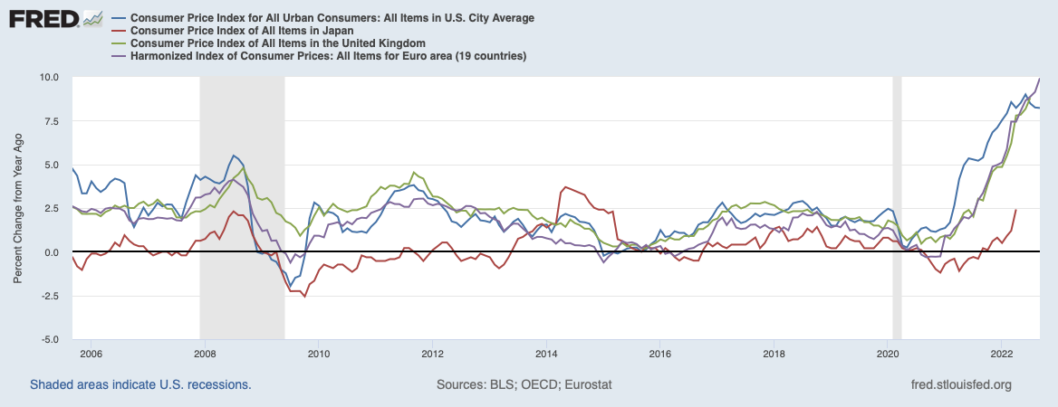
Source: St. Louis Fed FRED
We are not alone in this inflation fight. We are, however, alone in our level of hawkish aggressiveness. Simply take a look at Central Bank Rates from just a few of our friends around the globe.
Central Bank Rates from Around the Globe:

Source: St. Louis Fed FRED
With the exception of Canada, an exception that has been undone as of the past FOMC and BoC meetings, we have raised rates higher and faster than most of our other counterparts in the Developed world. This begs the question, why can we be more hawkish than our other CB friends?
Why Can The Fed be more Aggressive?
Japan
First, let’s talk about the obvious. Japan has had zero economic growth for almost three decades. It’s GDP has gone sideways due to a lack of productivity, an aging population, and an asset bubble that weakened its economy.
Japan GDP:
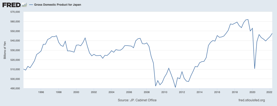
Source: St. Louis Fed FRED
After the 70’s/80’s “super bubble” in Japan, consumer prices have gone nowhere for the past 3 decades.
Inflation in Japan:

Source: St. Louis Fed FRED
Of course, the BoJ isn’t willingly letting this happen. In fact, the Bank has been actively conducting QE since the 90’s, and has only sped up the pace of purchases after the GFC.
BoJ Total Assets:
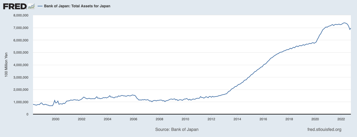
Source: St. Louis Fed FRED
Alongside QE, Japan has also tried to print its way out of the disinflationary backdrop its found itself in for decades.
Japan’s Monetary Supply:
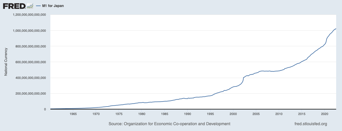
Source: St. Louis Fed FRED
So, Japan’s monetary policy, which should be inflationary in theory, has not led to any growth in Japan’s economy. Why? The simple answer is demographics.
YoY Population Growth For Japan:
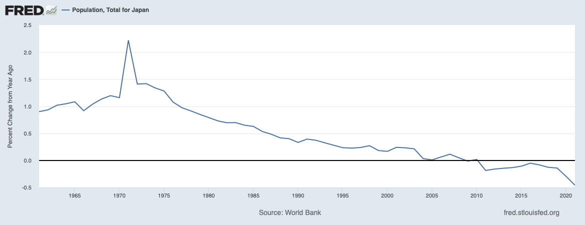
Source: St. Louis Fed FRED
Japan is not structurally like the US. There has not been any Baby Boom for the past 50 years. This in and of itself is deflationary. Less people leads to less production leads to less growth. Japan is unique today, in the sense that its Central Bank is trying to stimulate the economy by actively controlling the Yield Curve through unlimited asset purchases. This, of course, is leading to a weakening Yen in the hopes of spurring the economy into an inflationary regime. @macromicrodick 's “Puts on the Yen” thread has been a treasure trove for following the events happening in Japan. If you’re curious about how to play this, visit his thread for more information on some potential trade ideas.
Click Here for the Puts On The Yen Thread
Canada
“This tightening phase will draw to a close. We are getting closer, but we are not there yet”
-Bank of Canada Governor Tiff Macklem
Other than the Federal Reserve, Canada has been one of the most hawkish Central Banks in the developed world. In fact, until this past FOMC meeting where the Fed raised its Fed Funds rate by 75 bps compared to Canada’s 50 bps, Canada had raised rates faster than the Federal Reserve, raising 350 bps since December of last year, compared to the Fed’s 300 bps. Structurally, however, there is one major difference between Canada and the US, and it’s in the Housing Sector.
Canada Mortgages Outstanding:

Source: Bank of Canada
As you can see, a majority of mortgages in Canada are incredibly rate-sensitive. 58% of Mortgages in Canada are either Variable or Set to Mature in less than 5 years. This sensitivity to rates makes the Bank of Canada’s ability to fight inflation increasingly better than the Federal Reserve. The Bank’s raising rates takes away consumer’s spending power, which in turn lowers inflation. This makes the Canadian economy increasingly more fragile when compared to the US. Growth implications will take a hit alongside the consumer’s decreasing spending power, which in turn leads to a recession. Due to this fragility, a lesser level of aggression, which is what is being forecasted in markets, should be appropriate to defeat inflation from here on out.
Canada Interest Rate Forward Curve:

Source: The Montreal Exchange
England
“…Based on where we stand today, we think the Bank Rate will have to go up by less than currently priced into financial markets. That is important because, for instance, it means that the rates on new fixed-term mortgages should not need to rise as they have done.”
-Governor of the Bank of England Andrew Bailey
Like Canada and Japan, England is structurally more fragile than the US. On top of the leverage in England’s private sector investments, especially its pension funds’ Liability Driven Investments, it also has problems in its housing sector.
England Mortgages Outstanding:

Source: Financial Conduct Authority
As we saw in Canada, England’s homeowners are also much more rate sensitive when compared to the United States. As of the second half of 2021, 63% of mortgages in England either have a variable rate or are set to mature in the next two years. The same logic can be applied here as was applied in Canada. The Bank of England’s raising rates takes away consumer’s spending power, which in turn lowers inflation. This makes the English economy increasingly more fragile when compared to the US. Growth implications will take a hit alongside the consumer’s decreasing spending power, which in turn leads to a recession.
Europe
Lastly, we have Europe.
“The European Central Bank must keep raising interest rates to fight off inflation, even if the probability of a euro zone recession has increased.”
-European Central Bank President Christine Lagarde
Source: Reuters
In my opinion, Europe very well might be the most fragile of the regions we’ve visited. For one, Europe has a Central Bank board that wants to be hawkish but is fighting an unwinnable fight against not only supply-driven inflation, but an aging population and credit risks in their sovereign debt market.
“We can no longer rely exclusively on the projections provided by our models – they have repeatedly had to be revised upwards over these past two years. There are things that the models don’t capture. Sometimes the unexpected happens. So we have to pay attention to traditional indicators while also monitoring empirical data and what we expect to happen in terms of geopolitics, energy price developments and demographics.”
-ECB President Christine Lagarde
Source: European Central Bank
Most of inflation that the Euro area is experiencing can be accounted for by the Ukraine war. Whether it be Energy or Produce, this inflation war that the ECB is trying to win is, by definition, an unwinnable war. At least not while the only weapons that the ECB is using are their monetary policy tools.
Europe Energy HICP vs. US Energy CPI:

Source: St. Louis Fed FRED
While Energy prices have begun to come back down in the US, the same isn’t the case in Europe. Raising interest rates is not going to help increase Energy and produce supplies to the European consumer. In fact, all it will do, in my opinion, is bring us one step closer to a Sovereign Debt Crisis
Italian Gross Debt to GDP:

Eurozone Gross Debt to GDP:
Source: St. Louis Fed FRED
Can The Fed (And Other CBs) Fight Inflation?
“… Our objective, really, is to bring inflation down to 2 percent while the labor market remains strong. I think that what’s becoming more clear is that many factors that we don’t control are going to play a very significant role in deciding whether that’s possible or not.”
-Chairman of the Federal Reserve Jerome Powell, June 2022
Correlation between Chinese and USA PPI:

Source: St. Louis Fed FRED
While China has started to become less involved in the global production scene, it is still a very relevant place when it comes to macro implications. Whether it be additional demand for Commodities (if Covid Policy eases) or existing global production participation (i.e., Apple), a big driver of consumer prices can be traced to China. As you can see, Producer Prices, both in the US and China, have started to decelerate. Since PPI’s are broadly considered leading indicators of CPI’s, inflation should be in the process of peaking, if it hasn’t already. But is this deceleration in prices because the Fed and other CB’s killed demand, or is it because supply finally caught up?
Firstly, let’s dive into the ISM Manufacturing PMI. With a recent reading of 50.2%, manufacturing activity in the US has dramatically slowed since its peak in 2021. The index’s reading is now the lowest since mid-2020.
Manufacturing PMI Data:

If inflation has mostly been a problem of supply playing catch up with demand, then why is the PMI decelerating at such a rapid pace? Well, we’ve already seen earnings reports from retailers and other companies complaining of inventory gluts. Supply has finally caught up with demand after a two year long battle of playing catch up. With a lowering of manufacturing activity and an increasing inventory of supply, we have seen a lower and lower print of prices paid in the PMI data, as also reflected in the PPI data we reviewed earlier. Not only are prices diving, but manufacturing orders are now starting to slow down, there is no longer a backlog due to supply chain issues, and exports are slowing, as well.
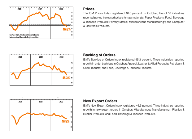
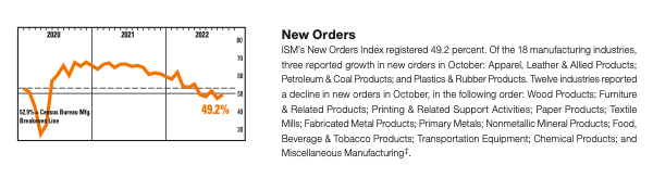
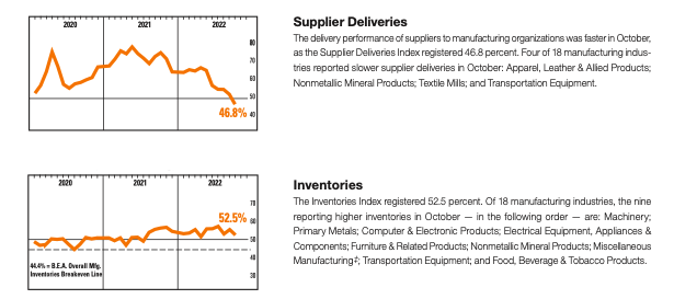
Source: ISM World
Supply chains are improving. Inventories are building, delivery times are diving, prices are coming lower and lower. All of this indicates goods inflation has peaked.
Let’s take a look at the internals of the Manufacturing PMI, those being the Regional Fed Manufacturing Surveys, and see if those are telling the same story.
Regional Manufacturing Business Surveys:
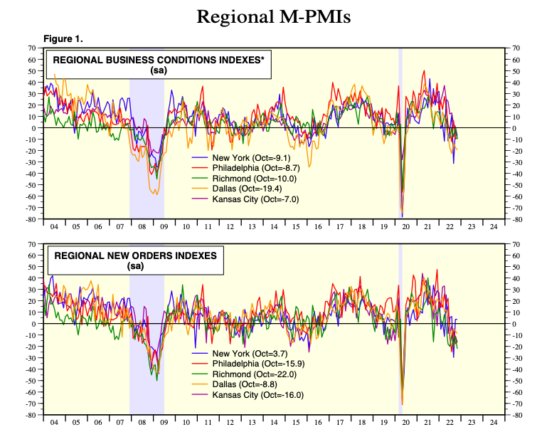
Source: Yardeni Research, Inc.
Not only is manufacturing demand coming down through a decline in the new orders reading, mostly due to the supply glut we previously touched upon, but business conditions are being forecasted to deteriorate. Goods inflation has peaked, that we can safely assume. Now, the question is how will this impact growth and earnings.
First, let’s take a quick look at one of the main drivers of supply side inflation for the majority of 2020-2021, semiconductor chips.
DRAMExchange Press Release: (Semiconductor Chips Supply/Demand Imbalance Reversing)
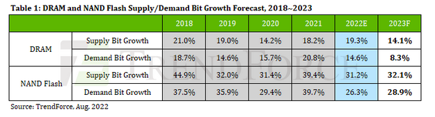
“According to TrendForce, DRAM market demand bit growth will only amount to 8.3% in 2023, sub-10% for the first time in history, and far lower than supply-side bit growth of approximately 14.1%. Data indicates the DRAM market to be severely oversupplied at least in 2023 and prices may continue to decline.”
-DRAM Exchange
Source: DRAM Exchange
The prevailing story in this sector seems to corroborate what we learned from the manufacturing data we previously reviewed. Looks like not only has supply growth finally caught up with the excess demand, an imbalance we’ve had for the better part of two years, but supply growth has actually encompassed demand for semiconductor chip products.
AMD Q3 22 Preliminary Results Press Release:

“Preliminary results reflect lower than expected Client segment revenue resulting from reduced processor shipments due to a weaker than expected PC market and significant inventory correction actions across the PC supply chain.”
-AMD
“The PC market weakened significantly in the quarter. While our product portfolio remains very strong, macroeconomic conditions drove lower than expected PC demand and a significant inventory correction across the PC supply chain.”
-Lisa Su, AMD CEO
Source: AMD
Let’s take a look at another major driver of inflation growth, automobiles. As you can see, inventories are slowly but surely starting to increase.
Auto Inventory YoY Change:
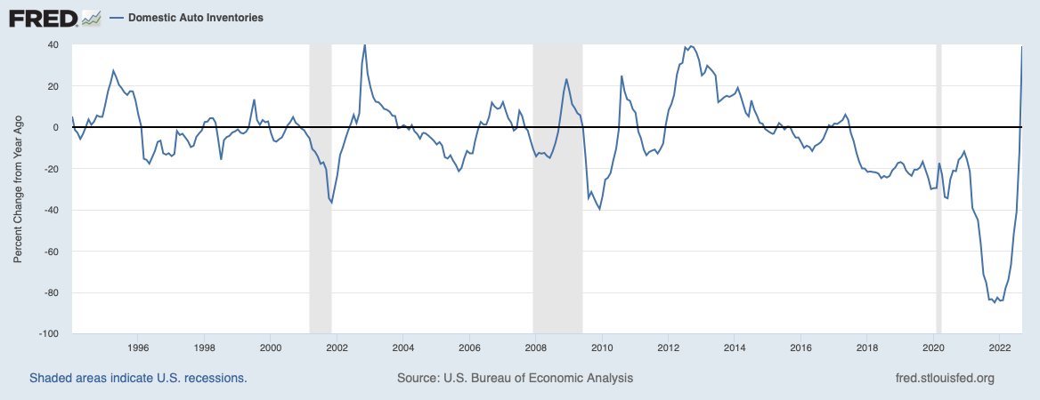
Source: St. Louis Fed FRED
Not only that but used vehicle prices are actually starting to act as deflationary pressures on consumer prices.
Manheim Used Vehicle Value Index YoY Change:
https://publish.manheim.com/content/dam/consulting/ManheimUsedVehicleValueIndex-BarGraph.png
Source: Manheim Consulting
As verified by the most recent CPI release.
Consumer Prices for Used Cars and Trucks:

Source: St. Louis Fed FRED
So, we’ve seen manufacturing activity is slowing down. The activity is most likely slowing due to a lower demand in manufactured goods. Deliveries are improving, prices are coming down, and new orders are fading. Two large drivers in goods inflation, semiconductors and cars, are starting to come down. Whether it be due to inventory gluts or lessened demand, we can be reasonably sure that goods inflation has now peaked, and some sectors are even contributing to disinflation.
But, what about services?
ISM Services PMI (Prices):

Source: ISM World
Really, the only measure of the Services PMI you have to see is the prices paid data. At 70.7, the measure is still grossly inflated. Above the 50 level of expansion, we still have a ways to go until services inflation is under control.
CPI Services Less Energy:
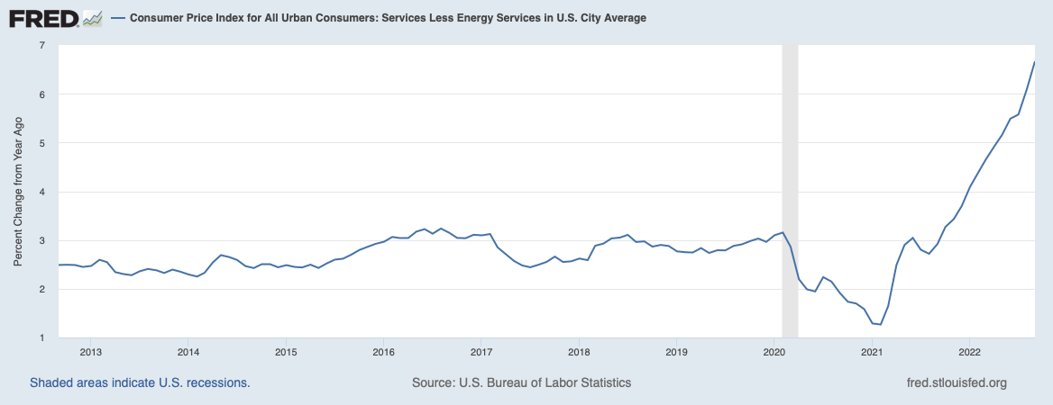
Source: St. Louis Fed FRED
So services inflation is not slowing down. Have the Fed and other CB’s not done enough? Or is there something else going on underneath the surface? Well, let’s look at just one component of services inflation, rent.
Zillow Rent Index Vs. US Rent CPI

“Zillow rent index annual growth usually leads rent CPI by 4-5 months. Rent prices account for the largest proportion of CPI, so it can be seen as a leading indicator for CPI.”
Source: MacroMicro
Now, when it comes to the CPI’s measure of rent, it can be extremely sticky. One reason for this stickiness is because it’s actually a lagging indicator. During disinflationary periods, such as recessions, Owner’s Equivalent Rent tends to remain strongly inflationary. One of the reasons for this is because the OER relies heavily on homeowner surveys and moving averages.
“The BLS estimates rental cost inputs for the CPI shelter and PCE housing services components using repeated surveys of existing tenants. Thus, the CPI and PCE price index mainly capture moderate changes in rents for existing tenants and miss larger rental updates that result upon tenant turnover. First, the BLS index tends to underestimate rent appreciation during expansionary periods and overestimate it during recessionary periods because it mainly reflects the renewal rent for existing tenants. In addition, the underrepresentation of new leases is exacerbated during recessions when the tenant turnover increases. Secondly, the BLS index construction method introduces additional smoothing effects by averaging the rent for each survey month and then calculating the six-month average growth rate on a rolling basis (i.e., January-July, February-August, etc.). Third, the BLS rent index lags contemporaneous rent measures. For example, if all leases are annual, then only 1/12th of the BLS sample will reflect market conditions with some observations reflecting economic environments that are nearly a year old. Thus, the BLS index only gradually incorporates market information, lagging the contemporaneous market rent measure by approximately one year.”
Source: Penn State Institute for Real Estate Studies
Now, whether the inflationary lag between actual rental prices and CPI rental prices is 4-5 months or up to a year, we reach the same conclusion. The Fed is driving the inflation fight looking in the rearview mirror. There is a good chance that goods inflation has peaked, now the fight will be with the sticky services components.
CPI Services Less Rent of Shelter

Source: St. Louis Fed FRED
More specifically, the fight will be between the Fed and a lagging Rent indicator. If we factor out our lagging CPI rent data, services actually decreased month-over-month. Outright disinflation. Excluding the Great Recession and 2020 lockdowns, this has only happened less than ten times in the past decade and a half.
The main idea I want to give to you with this is the Fed’s models, along with other CB models, are not perfect. They’ve said so themselves.
“We can no longer rely exclusively on the projections provided by our models – they have repeatedly had to be revised upwards over these past two years. There are things that the models don’t capture. Sometimes the unexpected happens. So we have to pay attention to traditional indicators while also monitoring empirical data and what we expect to happen in terms of geopolitics, energy price developments and demographics.”
-ECB President Christine Lagarde
Source: European Central Bank
“I would have little confidence (in) the (Summary of Economic Projections) forecast, if we made a forecast today, if we were doing an SEP today, the pattern has been that one after another they go up and that’ll end when it ends, but there’s no sense that inflation is coming down…”
-Chair of the Federal Reserve Jerome Powell
Source: Federal Reserve
Now, we can be fairly certain that goods inflation has peaked and overall inflation should be coming down next year, given the stickiness and lag we talked about in shelter and services inflation. The question now, as I said before, is turning to growth implications. How deep will this contraction be?
Growth or Recession?
Firstly, let’s turn to employment. The Fed’s mantra of “hot Labor Market” has recently taken a hit. The most recent Non-Farm Payroll release showed an increase of 260k+ jobs. However, this measure only came from the establishment survey. If we dig into the household survey, the narrative starts to change.
Before we continue, the main difference between the establishment and household surveys are as follows:
“The household survey has no duplication of individuals, because individuals are counted only once, even if they hold more than one job. In the establishment survey, employees working at more than one job and thus appearing on more than one payroll are counted separately for each appearance.”
-Source: St. Louis Fed FRED
Workforce Employed Full Time (MoM Change):

Source: St. Louis Fed FRED
Digging into the household survey, the NFP data starts telling a different story. In 5 out of the last 7 NFP data releases, full time employment actually decreased month-over-month. A look at the part-time workers section can tell you where some of those formerly full-time employees went.
Workforce Employed Part Time (MoM Change):

Source: St. Louis Fed FRED
Whether it be from companies cutting costs, lowering employee hours, or simply consumers in need of more money, the same answer can be reached. This is not the result of a strong labor market. The only thing that is strong in the labor market is wage growth.
Wages (YoY Change):
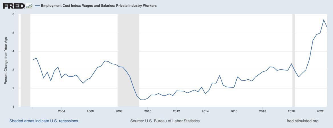
Source: St. Louis Fed FRED
Labor Force Productivity (YoY Change):

Source: St. Louis Fed FRED
The latest data shows wage growth year-over-year to be strong. However, at this point in time, this is more due to employees demanding higher wages because of inflation than actual labor productivity. Even with year-over-year wage growth above 5%, real wages are still negative. Just one look at the labor participation rate can show you why employers are willing to increase wages with no increase in labor productivity.
Labor Force Participation Rate Vs. Population Growth:
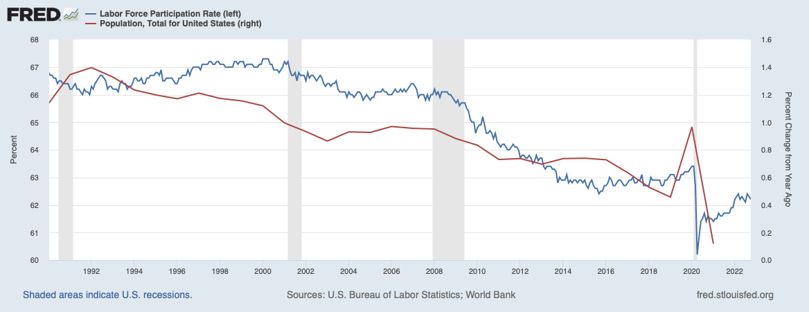
Source: St. Louis Fed FRED
Companies were in desperate need of workers when there was a need to meet excess demand. Now that we’ve seen demand start to weaken and supply has finally caught up, and in some cases exceeded, there won’t be the same demand for workers that there was in 2020-2021.
Let’s turn to GDP to see if we can see any of this weakness from the most recent report.
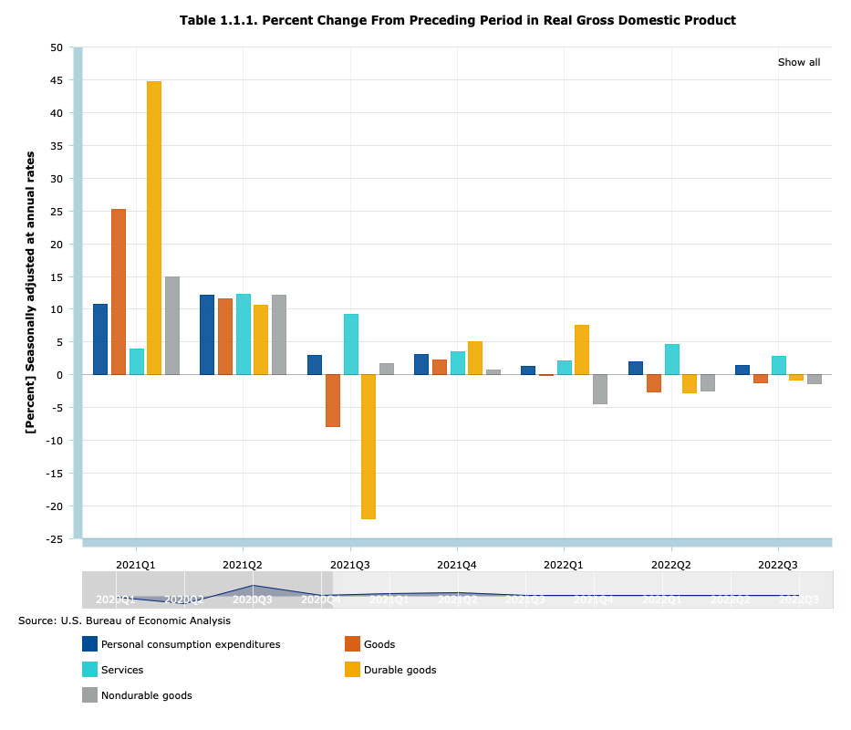
GDP Components QoQ Change (Since Q1 2021):

Source: Bureau of Economic Analysis
Our last GDP print was positive. But let’s look under the hood and see what’s really going on.
PCE Components QoQ Change:
Source: Bureau of Economic Analysis
Firstly, personal consumption expenditures was a small part of the positive GDP print. Consumers are still spending, however this confirms what we already suspected. Demand for both durable and nondurable goods is weakening. The only positive from the previous two GDP prints in terms of consumption was from the services sector. As we stated previously, goods inflation has peaked, but services still remain sticky.
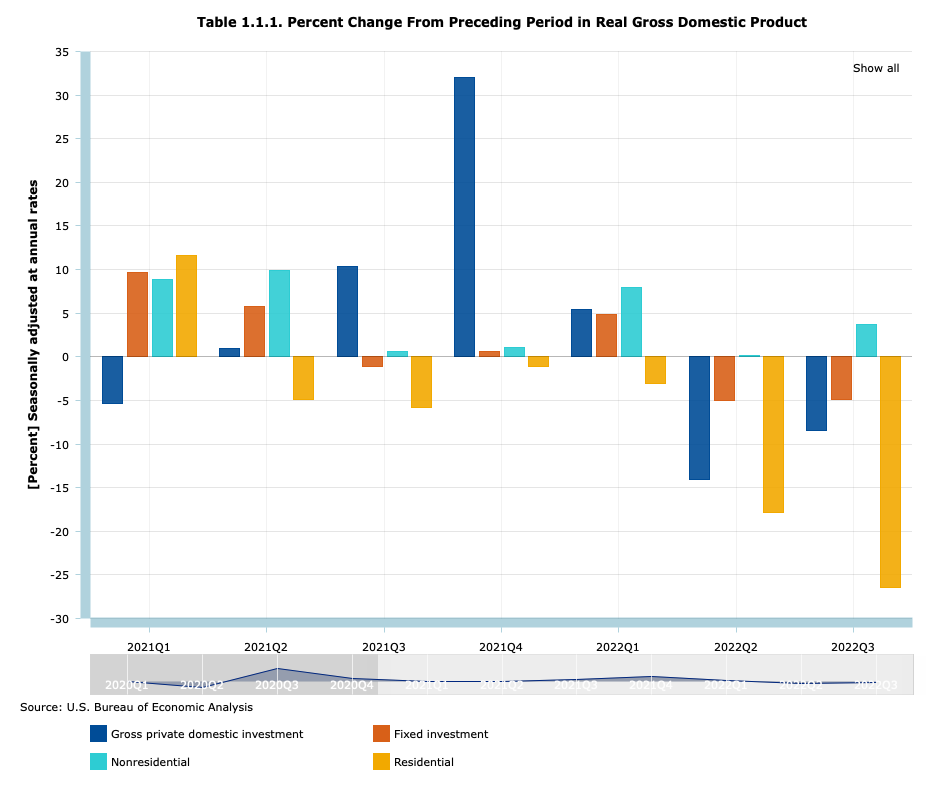
Gross Private Domestic Investment QoQ Change:
Source: Bureau of Economic Analysis
Now, a look at private domestic investments will get you wondering how exactly we even got a positive GDP print. Not surprisingly, residential investment is very weak. Six of the previous seven GDP prints had negative Private Residential Investment growth, with the weakest quarter-over-quarter change coming from the most recent print. Overall, private domestic investment has been negative for the past two quarters.
Net Exports Contributions to QoQ Change in GDP:

Source: Bureau of Economic Analysis
Lastly, let’s look at the real reason as to why the GDP report was positive this past quarter. Net exports jumped this past quarter, mostly due to SPR petroleum exports outpacing demand for imported goods. Just to be clear, Net exports contributed to a quarter-over-quarter increase of 2.77% in the GDP. This means that net exports alone contributed to 106% of the overall quarter-over-quarter growth of GDP, which was 2.6%.
Now that we’ve dove into the GDP report, we’ve seen that the latest print was barely positive due to politics, especially in the quarter-over-quarter change in net exports. This weakness, however, will take time to trickle into the CPI report. We’ve gotten our first weak inflation report, mainly due to goods inflation coming back down. But services still remain sticky, and as long as the Fed is driving looking at the rearview mirror, there is a higher chance of something breaking. If we take a look at the bond market, participants are screaming “the Fed will break something”.
Curve Inversions (10-Year Minus 2-Year and 10-Year Minus 3-Month):
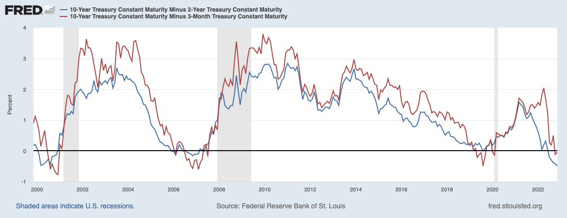
Source: St. Louis Fed FRED
The 3-month is now the higher than the 10-year, with the 2-year/10-year being inverted for months now. The pivot has been priced into the bond market since the curve inverted. The question now is…
What Will Break First?
Yield Curve:
Source: St. Louis Fed FRED
As you can see, inflation has led to rocketing interest rates. This hit to financing and credit markets has been historic. Not only has there been a sustained sell off in bonds, but the volatility has remained elevated, as well.
MOVE Bond Volatility Index:
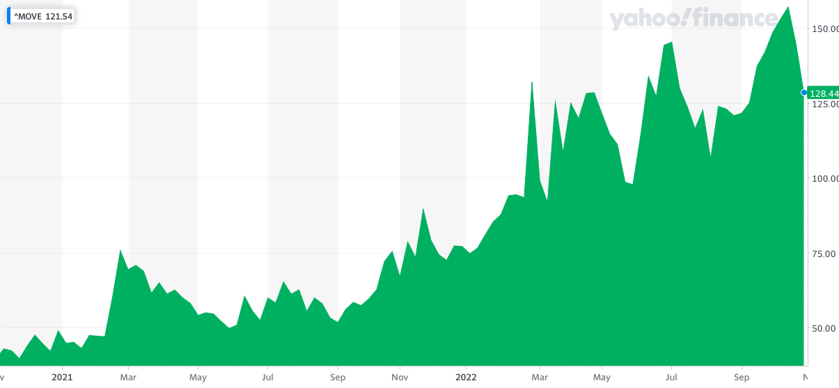
At its peak, the MOVE index reading of over 150 was implying a move of over 10bps per day in the 10-year bond yield. Currently staying over 100, the index’s reading is still implying a move of over 6bps per day in the 10-year bond yield. This volatility is pretty large when you consider that the 10-year yield is mostly known for being the risk-free rate, typically used for financing and investing. This level of volatility most likely is coming from a decreased level of liquidity in the UST market.
Treasury Market Depth:

Source: FRBNY Financial Stability Report
“The Treasury market has continued to function smoothly over the period from the May report, but measures of trading costs have remained moderately elevated and liquidity appears to be less resilient than is typical. These liquidity strains appear to be primarily a consequence of the elevated interest rate volatility associated with uncertainty about the economic outlook. While measures of trading costs such as bid-ask spreads are only moderately elevated, the fact that intermediaries are posting historically low volumes of quotes may mean that the risk of a sharp further increase in trading costs could be higher than usual.”
-Federal Reserve Financial Stability Report
As you can see, liquidity has been steadily decreasing since the middle of last year. The low liquidity, as mentioned in the Federal Reserve’s Financial Stability Report, mostly comes from uncertainty about the Fed.
On-The-Run Liquidity Measured by Average Market Depth:

Source: FRBNY Financial Stability Report
The top-of-book orders for On-The-Run USTs, the most liquid UST securities on the market, have started sliding down since October of last year, and liquidity has remained low all of this year.
Average Liquidity Relative to Outstanding Volumes:

Source: US Department of the Treasury
As you can see here, most of the outstanding amounts in UST securities are in Off-The-Run treasuries, the most illiquid UST security. If On-The-Run treasuries are having liquidity concerns, then you can only assume that Off-The-Run treasuries are having a liquidity crisis.
Just as a quick aside, I would not be surprised if the Treasury commenced their recently-talked-about Buybacks next year by trying to access the RRP facility. There’s $2.2 Trillion in liquidity in Reverse Repo basically stuck there because of the more attractive yield they can get, which is 3.05% overnight compared to 3.01% on a 4-week treasury bill. Now, off-the-run treasuries are having liquidity problems, as we’ve already discussed. What would happen if the Treasury commenced a buyback is that they would flood the treasury market with T-Bills. 2 things would happen from this:
- The excess supply of T-bills, in the short term, would raise rates and in turn make T-bills more attractive. The liquidity from the RRP would then be accessed because they can finally get the attractive yield they got from the Overnight RRP rate.
- Since the treasury flooded the market with T-Bills, they would be bringing the average maturity of the overall debt closer and closer. As the T-bills mature, the supply of overall debt would decrease. Along with the decrease in treasury supply would come lower yields, assuming demand for treasuries doesn’t change.
Now, back to our regularly scheduled program.
Most likely, this liquidity crunch is coming from two places. Firstly, uncertainties from the Fed’s outlook and the path of interest rates, as discussed before, and secondly, sustained selling from international Foreign Reserve Managers and other Foreign Officials in an effort to strengthen their currencies
Foreign Vs. Direct Retail Investor Ownership

Source: US Department of the Treasury
As you can see here, more than 30% of all treasury securities outstanding are owned by Foreign investors. If you include the Federal Reserve’s bloated balance sheet, that number jumps to 60%. Selling from both Foreign investors and no reinvestment from the Fed’s Quantitative Tightening is straining the On-The-Run market, which in turn is turning the usually illiquid Off-The-Run securities into a liquidity crisis.
Foreign Official Holdings of UST Securities:

Source: US Department of the Treasury
As you can see here, Foreign officials have been continuously selling their UST holdings since mid-2021. This has only exacerbated the already weakening liquidity due to the uncertainties of the economic outlook and the Fed’s interest rate policy.
Foreign Private Holdings of Long End UST Securities
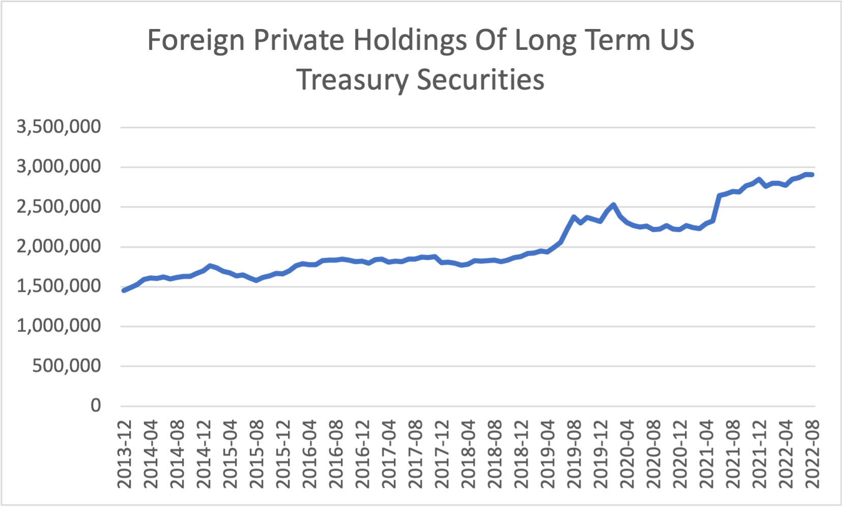
Source: US Department of the Treasury
Foreign Private UST holdings, however, are increasing since the same period. There is a liquidity crisis, but there are buyers for these securities. My theory is Foreign private investors are worried the Fed will over-tighten and are buying longer end Treasuries in anticipation of a pivot due to this over-tightening, which is reflected in the yield curve inversions we saw previously and corroborated by the Fed’s own words.
“The historical record cautions strongly against prematurely loosening policy. We will stay the course, until the job is done.”
“…if we were to over-tighten, we could then use our tools strongly to support the economy, whereas if we don’t get inflation under control because we don’t tighten enough, now we’re in a situation where inflation will become entrenched and the costs, the employment costs in particular, will be much higher potentially. So, from a risk management standpoint, we want to be sure that we don’t make the mistake of either failing to tighten enough, or loosening policy too soon.”
“Let me say this, it is very premature to be thinking about pausing.”
-Chair of the Federal Reserve Jerome Powell
Source: Federal Reserve
USD Strength Feedback Loop:

This increased selling from Foreign Officials is leading to a strengthening dollar. The more active selling Foreign Reserve Managers and other officials partake in, the higher yields go. The higher yields go relative to other sovereign markets, the stronger the dollar gets.
US Dollar Index:
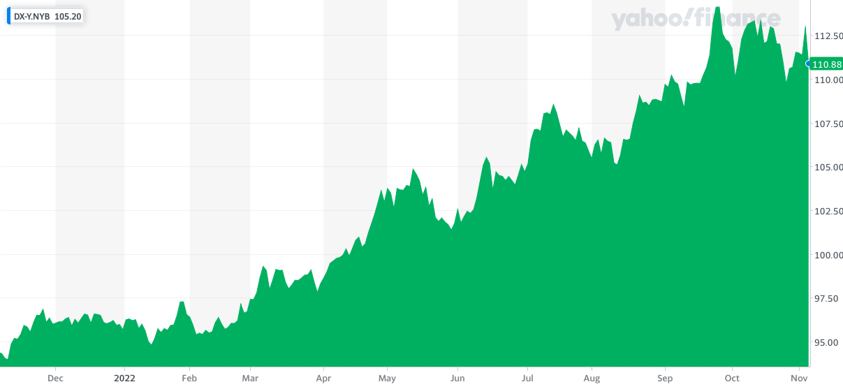
Source: Yahoo Finance
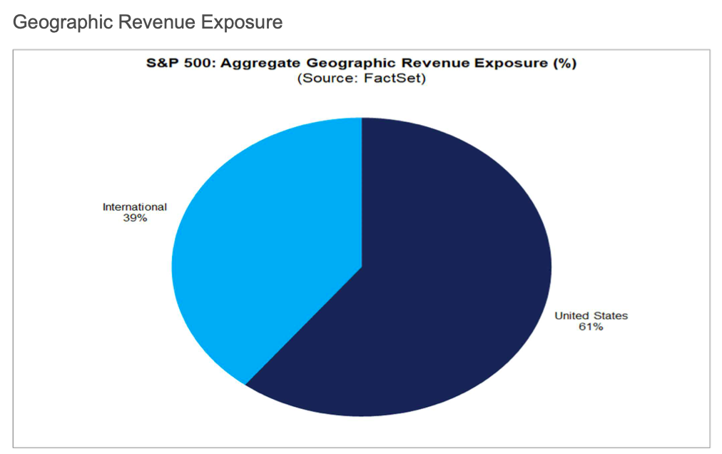
This strong dollar is not something we want. Almost 40% of all of the S&P 500 revenue today comes from overseas. If the dollar strengthens relative to other FX, that means less revenue back home.
S&P 500 Geographic Revenue Exposure:
By Sector:

Source: FactSet
Earnings:
Due to all we’ve gone over here: strong dollar, weaker consumer demands, supply gluts, and higher financing rates, earnings have taken a significant hit.
"The blended (year-over-year) earnings growth rate for Q3 2022 is 2.2%, which is below the 5-year average earnings growth rate of 14.6% and below the 10-year average earnings growth rate of 8.8%. If 2.2% is the actual growth rate for the quarter, it will mark the lowest (year-over-year) earnings growth rate reported by the index since Q3 2020 (-5.7%).
“The Energy sector is the largest contributor to earnings growth for the S&P 500 for the third quarter. If this sector were excluded, the index would be reporting a decline in earnings of 5.3% rather than growth in earnings of 2.2%.”
Source: FactSet
Conclusion
We’ve gone over a lot of things here. Firstly, we took a look back. We saw how a forecast in lowered consumer strength actually resulted in supply/demand imbalances, which led to decades-high inflation. Then, we saw what the Fed is doing to calm down inflation, and why it can be more aggressive than other central banks. After, we discussed why the Fed actually had little to do with why the most recent report showed a weakening inflation print, with more of it having to do with lessened demand for manufactured goods and overall goods inflation peaking because of it. As we discussed, the Fed is driving the inflation fight looking through the rearview mirror. Services inflation is not only sticky, it’s a lagging indicator. Most of what we went over today is pointing to recession. Lesser spending power in international consumers, weakened demand, supply gluts, goods disinflation, or in some cases deflation, higher financing rates, a strong US Dollar, weak earnings growth, and a weakening labor market. Now, we know where we’ve been, where we are, and we have a somewhat good feeling of where we might be heading. So, what’s the trade?
Firstly, weakness in residential investments from the GDP report, alongside higher interest rates, make buying puts on homebuilders look attractive. Buying longer dated puts on an ETF like $ITB or $XHB looks like a good idea. Next, let’s move into the credit market. I would consider credit markets and fixed income the place to be going into 2023. A risk-free rate of close to 4% is not great when it comes to factoring in an equity risk premium in a weakening global economy. Investing in short-term T-Bills and holding to maturity is one trade I would consider (and actually one I’ve been in for quite some time). This trade can also be mirrored by buying $SHY shares, an ETF that tracks short-ended UST securities. The second trade I would recommend is accumulating long-term securities, or through an ETF proxy like TLT. Through this trade, you are betting that the Fed will be forced to lower interest rates in the future. Lower yields result in higher bond prices. Along with these two trades, you could buy longer-dated $SPY puts betting on the weak Earnings growth to continue due to all of the recessionary reasons we mentioned previously. Lastly, I would consider going to municipal or corporate IG bonds. With both of these securities, you are betting on lower yields, but are adding some risk. First, with corporate bonds you are assuming additional credit risk. Before investing in Corporate Bonds, make sure you are comfortable with the company’s financial health. Lastly, both municipal bonds and corporate bonds are not as liquid as UST securities, as we saw previously when comparing On-The-Run liquidity to Off-The-Run liquidity. This low liquidity leads to a chance of not getting a fair price when trying to exit a trade.
Source: US Department of the Treasury
I hope I’ve, at the very least, helped you see where we currently stand. Today’s macroeconomic conditions are worrying, but are also the conditions future economists will be writing about in the years to come. So enjoy the ride, it will be bumpy. Thanks for reading!
